Modal
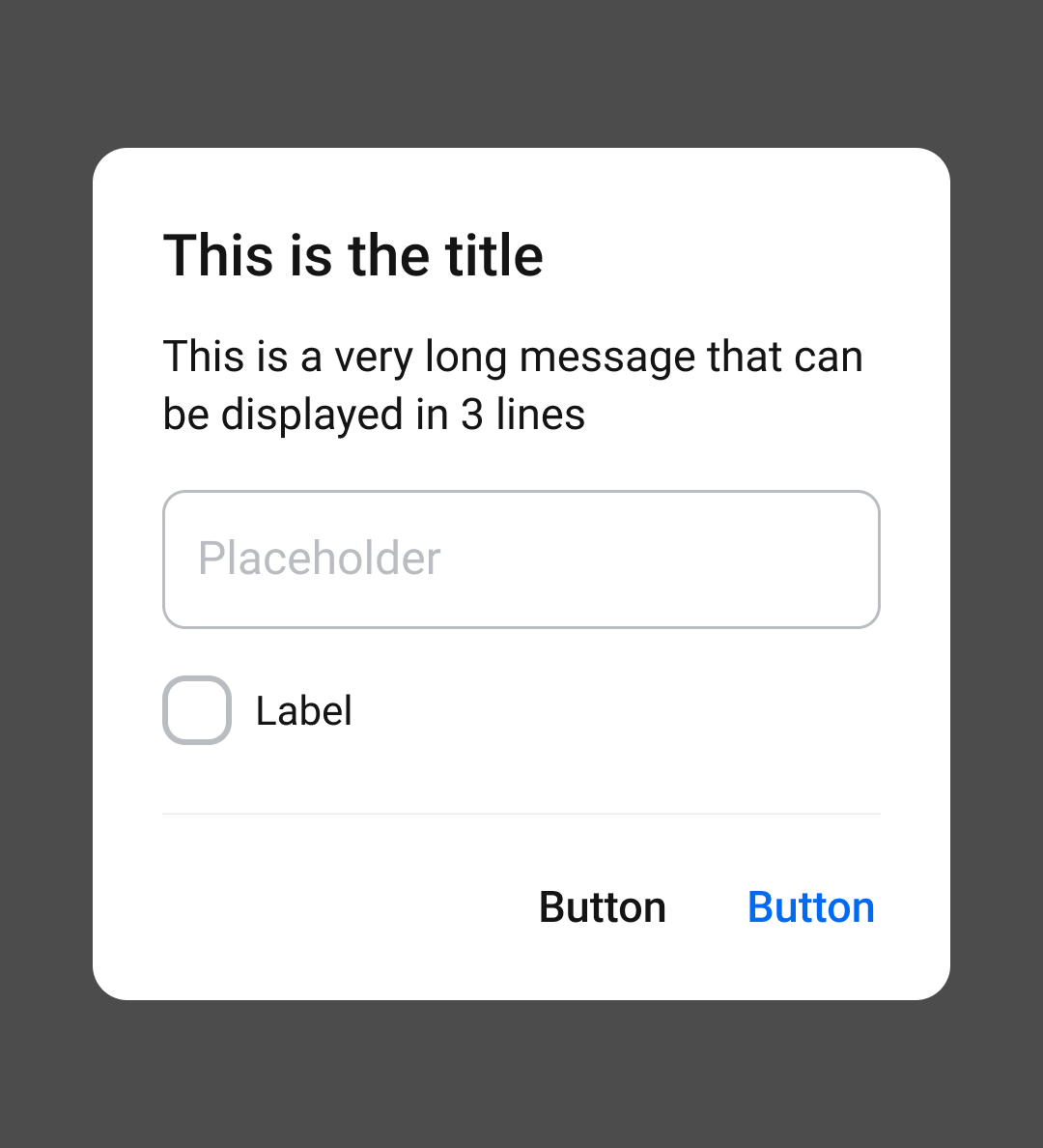
1. Information Dialog
Hộp thoại:
- Yêu cầu user xác minh xem họ muốn tiếp tục hay hủy thao tác
- Hiển thị thông tin user cần được biết
Hộp thoại cùng với dim background chen ngang trước khi hệ thống thực hiện lệnh của user
Note: Max number of stacking modals = 2
Components
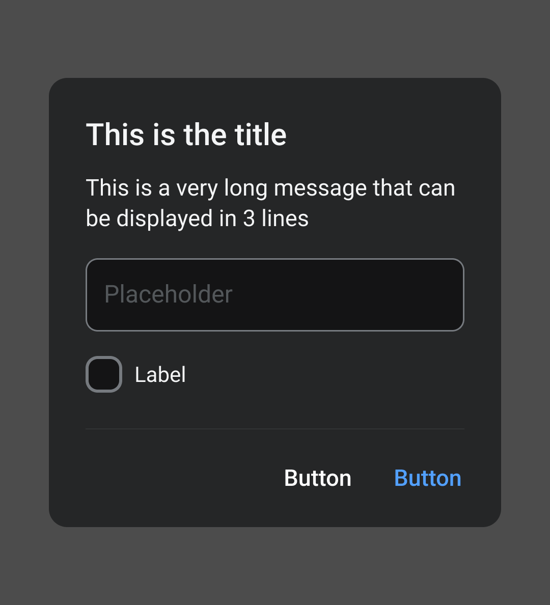
Anatomy
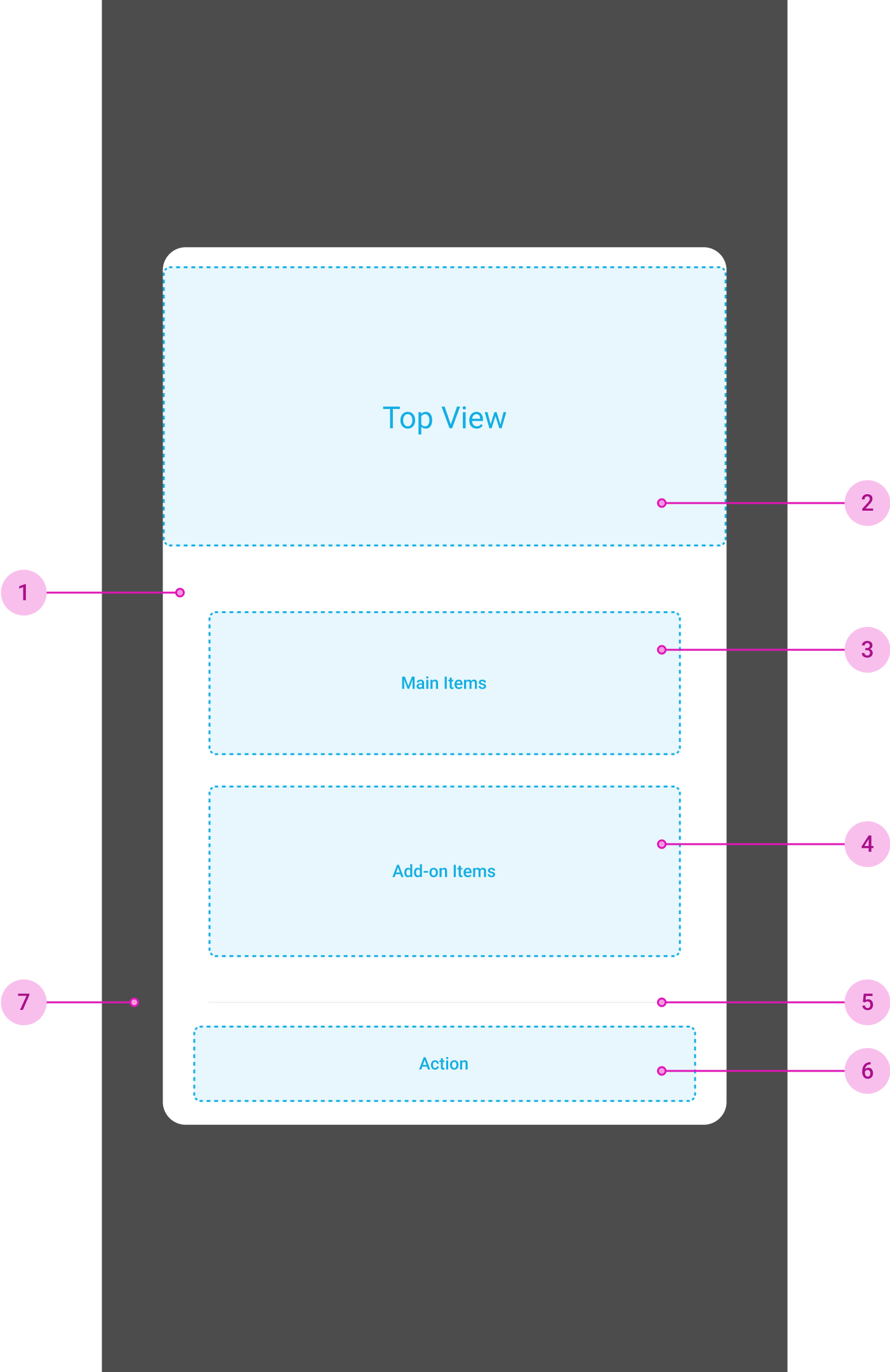
- 1Container
- Required
- 2Custom View
- Optional
- Có thể edit tuỳ ý trong view này
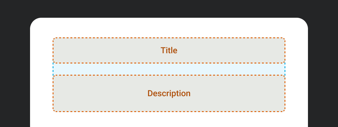
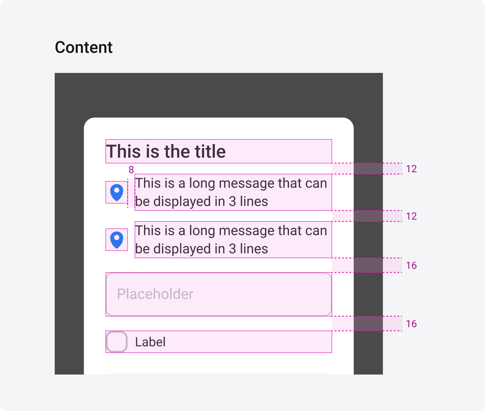
- 3Main Items
- Required
- Include
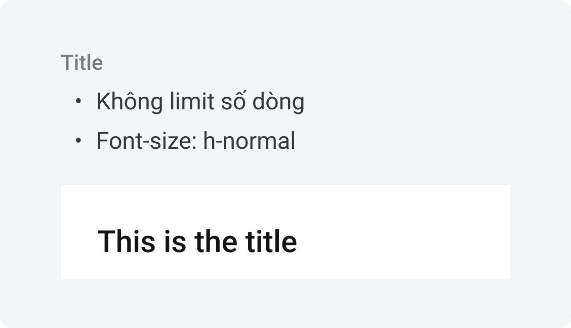
- Title
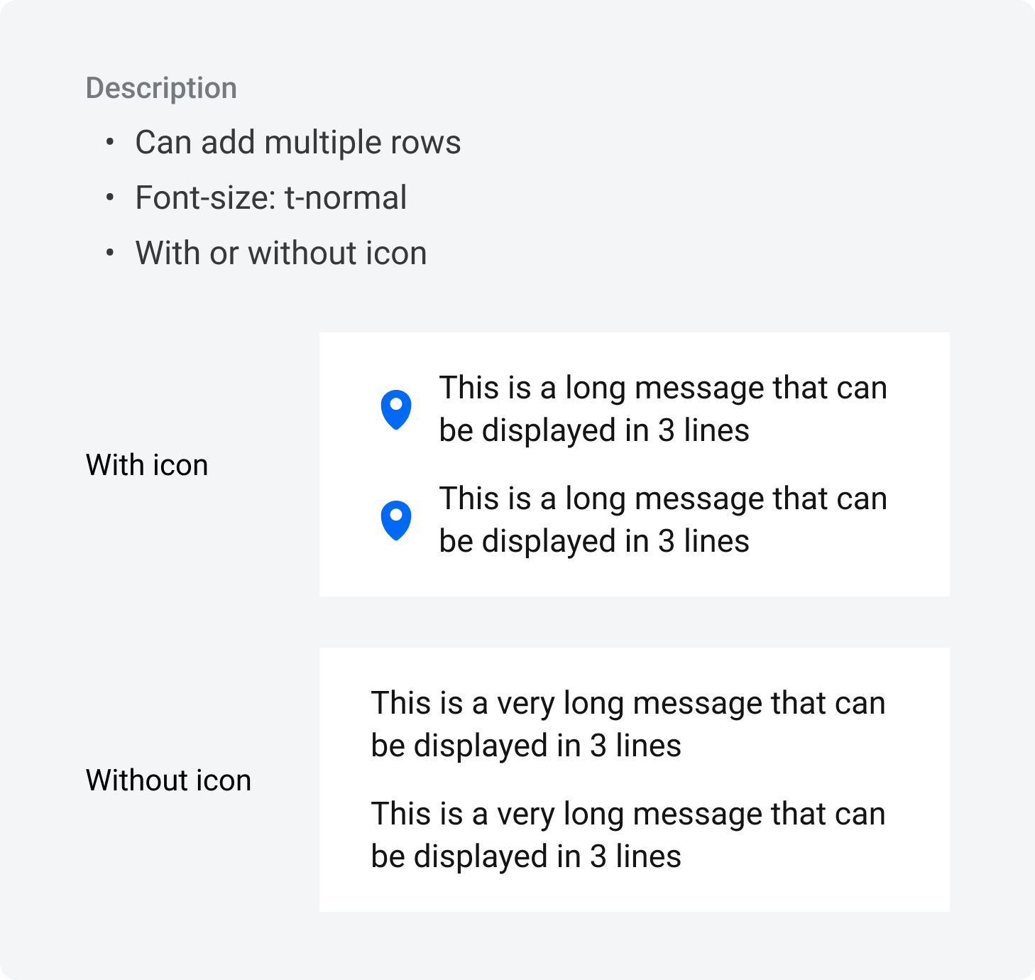
- Description
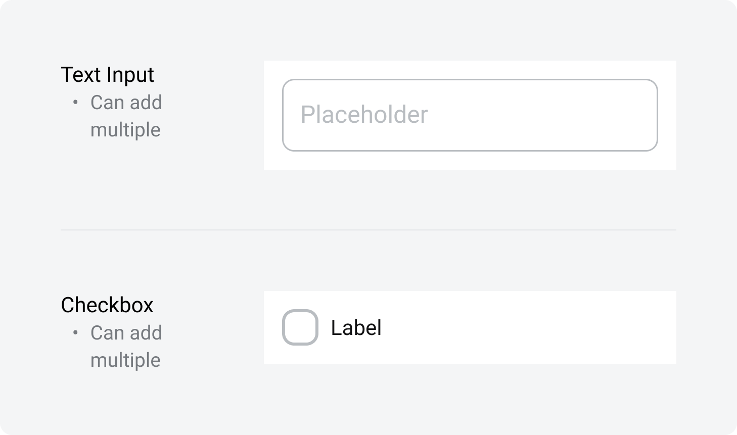
- 4Add-on Items
- Optional
- Can be these items
- 5Divider
- Required
- 6Action
- Required
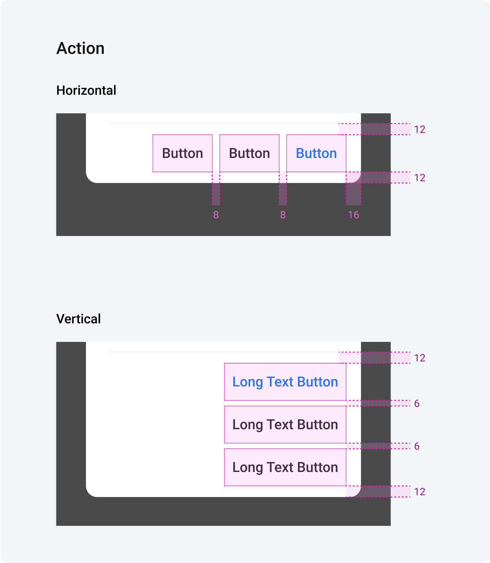
- Hiển thị:
- Default: 1 primary action (blue or red)
- Optional: thêm tối đa 2 secondary actions
- Vị trí:
- Default: horizontal
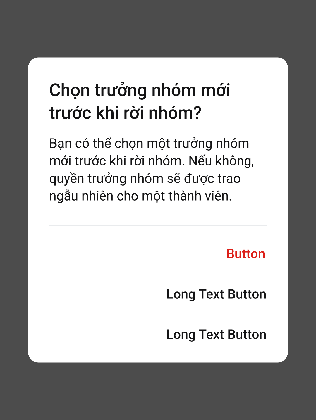
- Trường hợp text dài, chiều ngang không đủ hiện -> đổi sang dạng vertical
- 77. Dim Background
- Required
Specs
Max height of dialog = 80% screen height
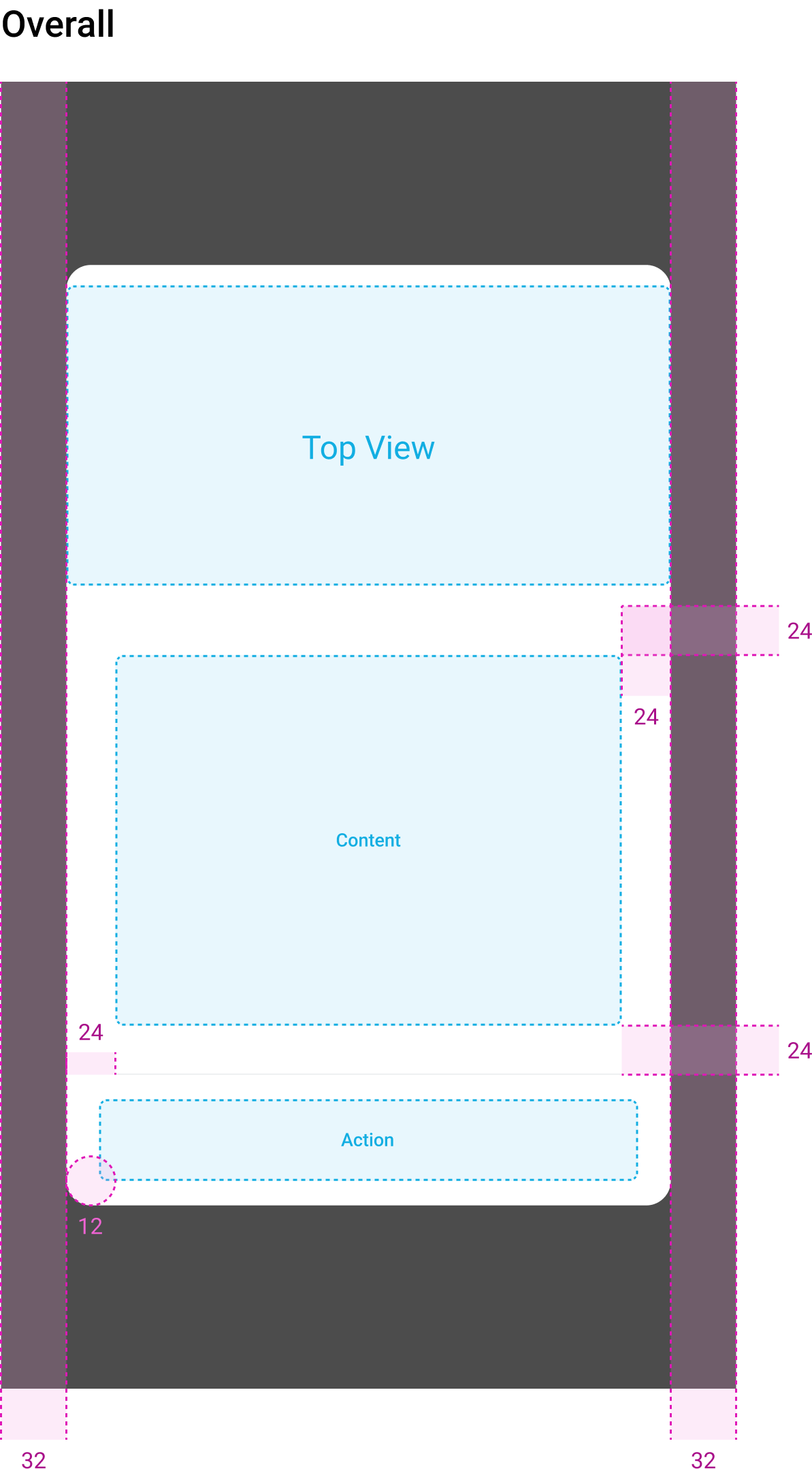
Behavior
Dismiss
User có thể tắt Modal bằng cách
- Tap out to dismiss (tapOutsideToDismiss)
- Có thể ON/OFF
- Default = ON
- Tap dismissive button (bên ngoài truyền vào)
Focused Text Input with keyboard
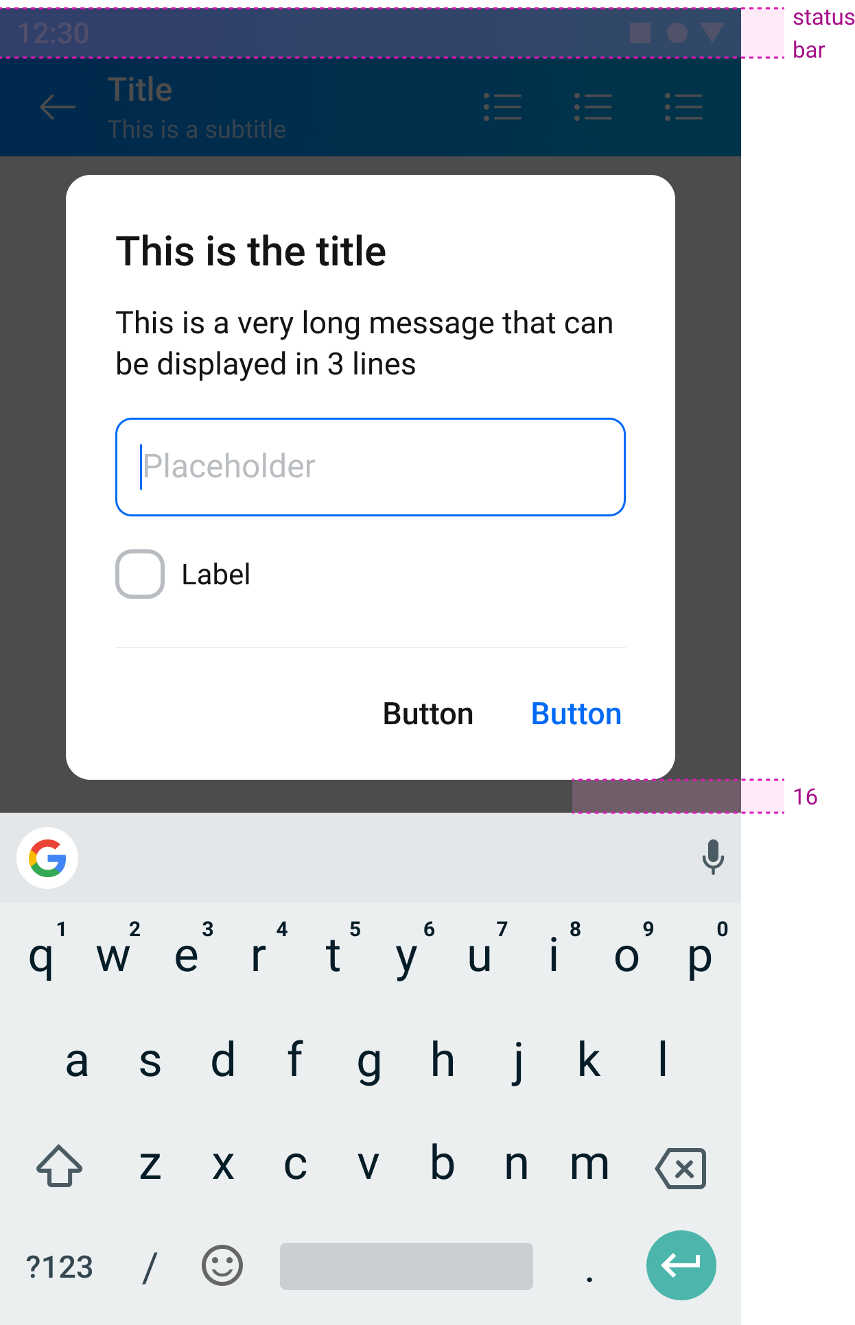
Trường hợp 1 Modal được đẩy lên trên keyboard
- Modal cách keyboard 16px
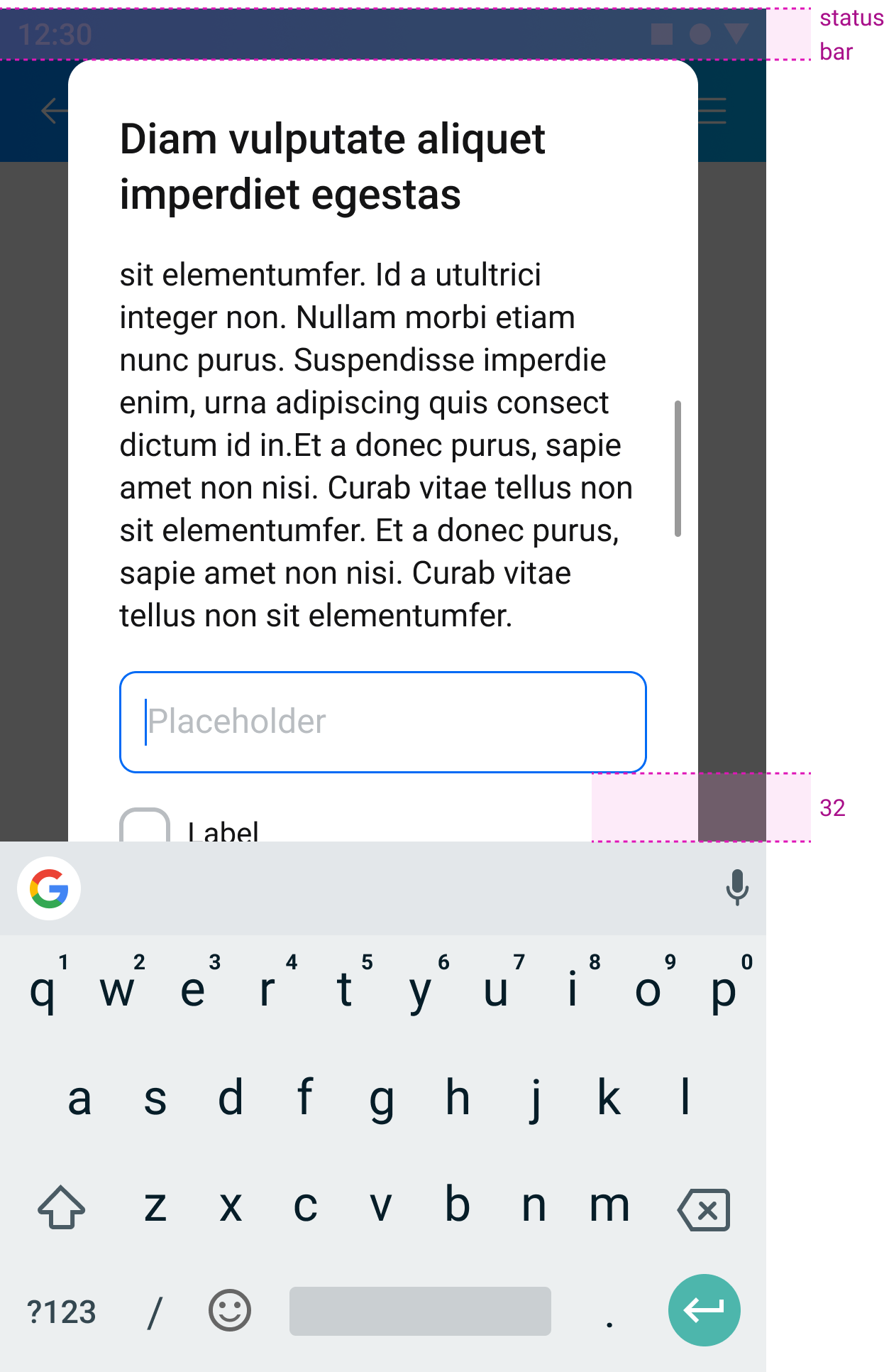
Trường hợp 2 Modal được đẩy lên đã chạm status bar nhưng không đủ chỗ đẩy full modal
- Vùng Content thành Scrollview
- Focused Text Input cách keyboard 32px
Điều kiện đóng keyboard
Thoả 1 trong các điều kiện sau:
- Khi user bấm vào bất kì vùng nào trong InformationDialog, ngoài các InputField
- Khi user dismiss InformationDialog
*Khi user scroll trong InformationDialog, không đóng keyboard.
Usage
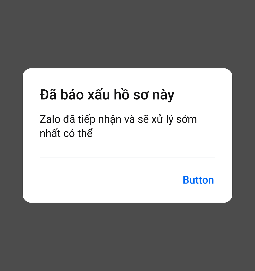
Confirmation Dialog
Normal
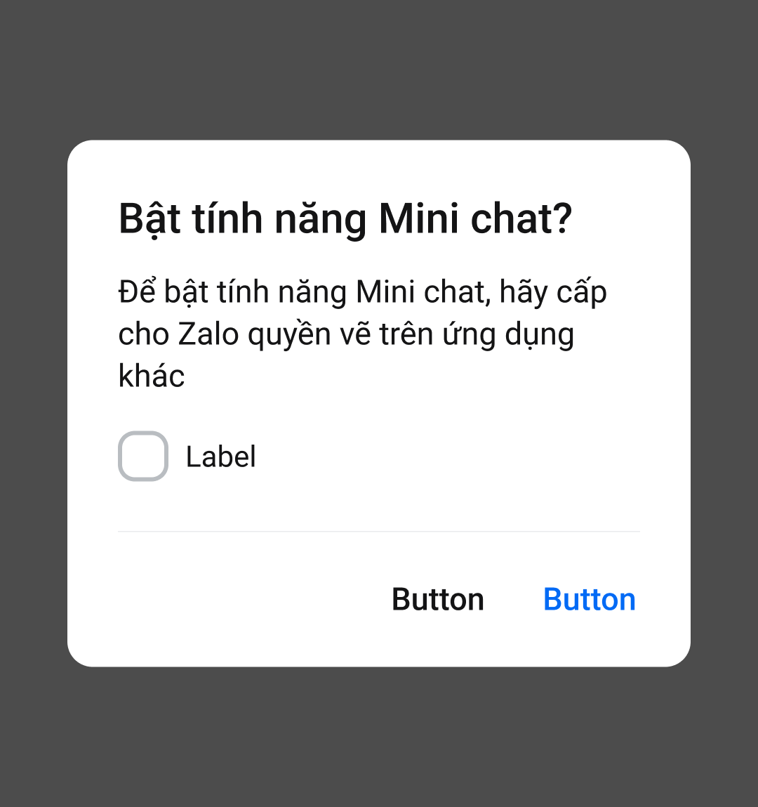
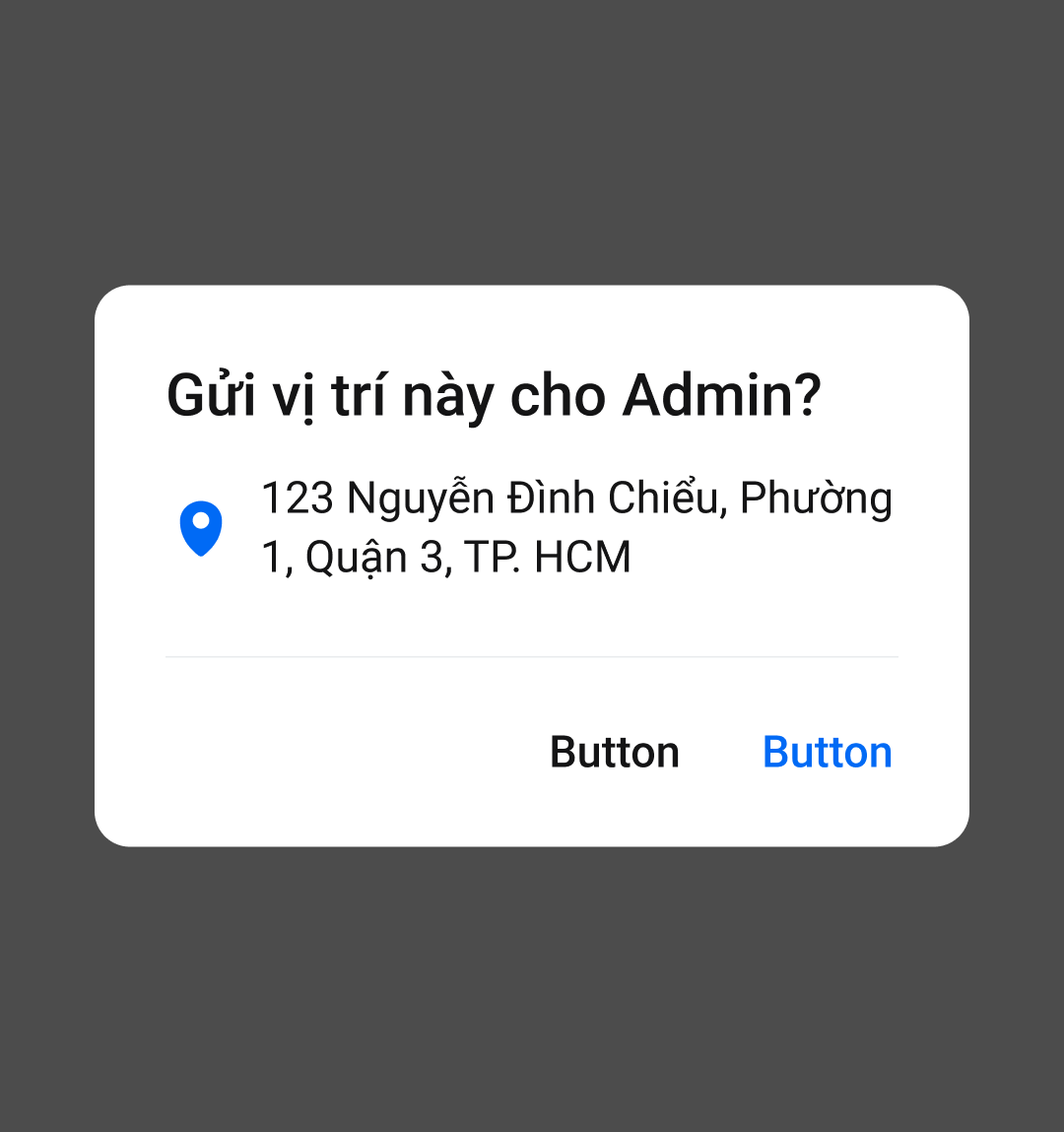
Dialog xuất hiện sau khi user chọn hành động bất kì cần được confirm trước khi hành động được thực hiện
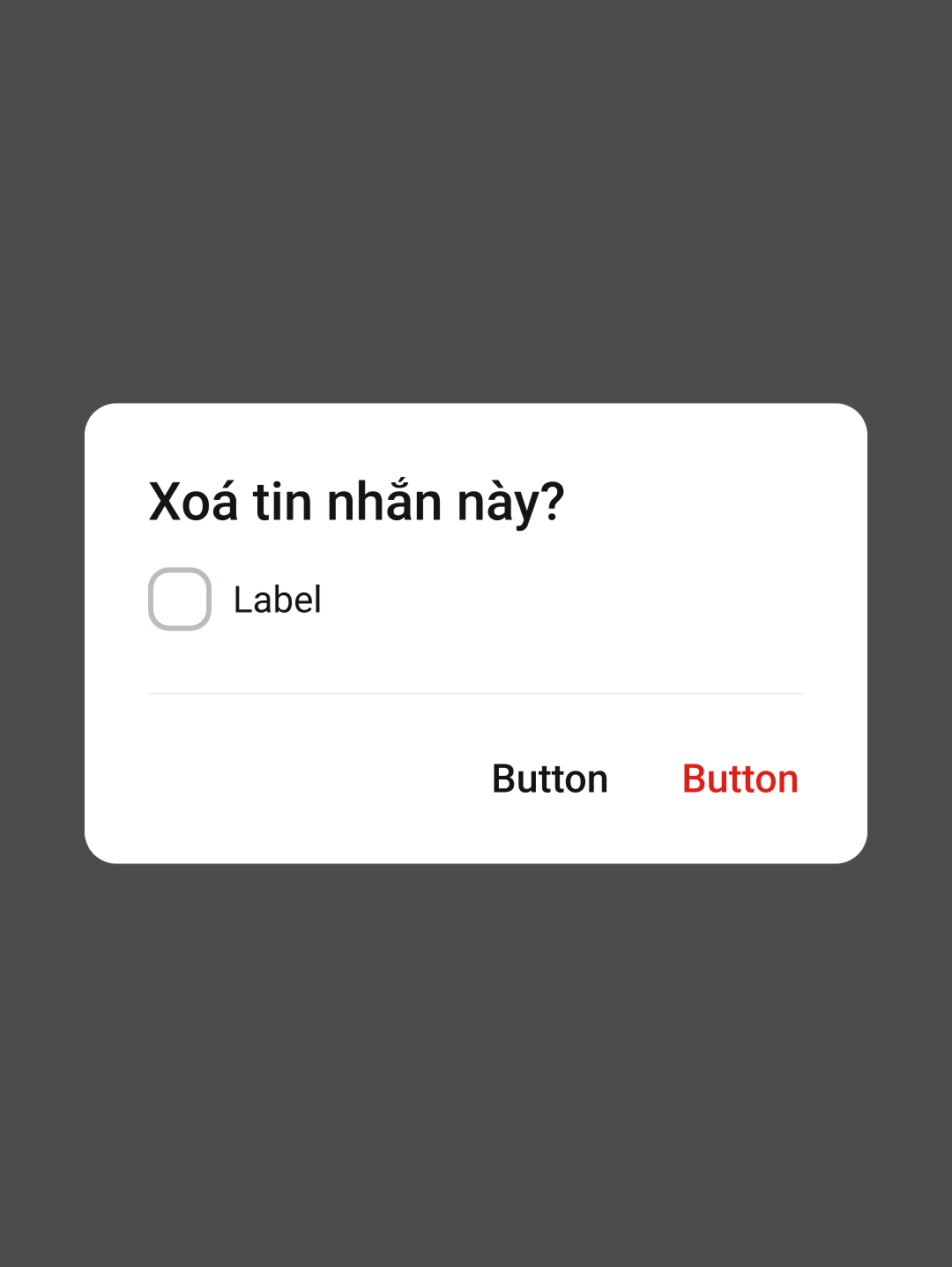
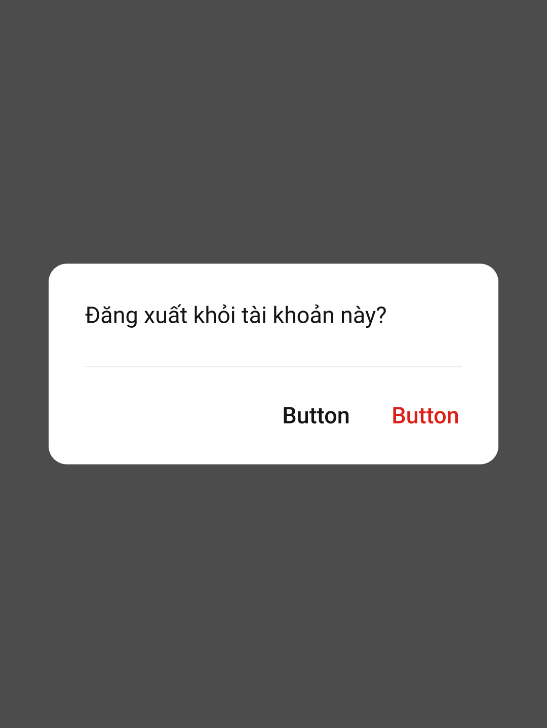
Danger
Dialog xuất hiện sau khi user chọn hành động mang tính destructive (Xóa, Thoát, Thu hồi, Đăng xuất,...) cần được confirm trước khi hành động được thực hiện
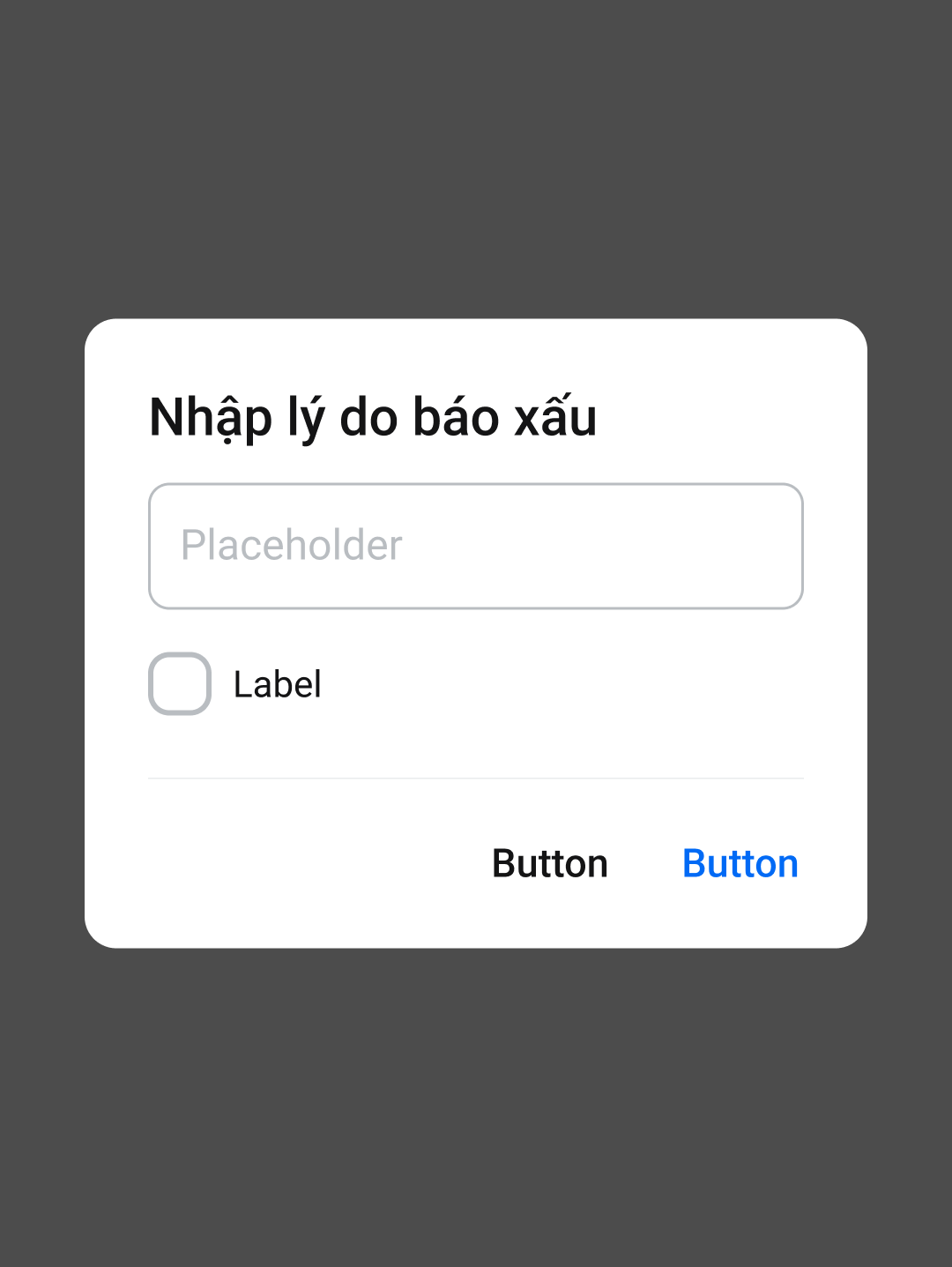
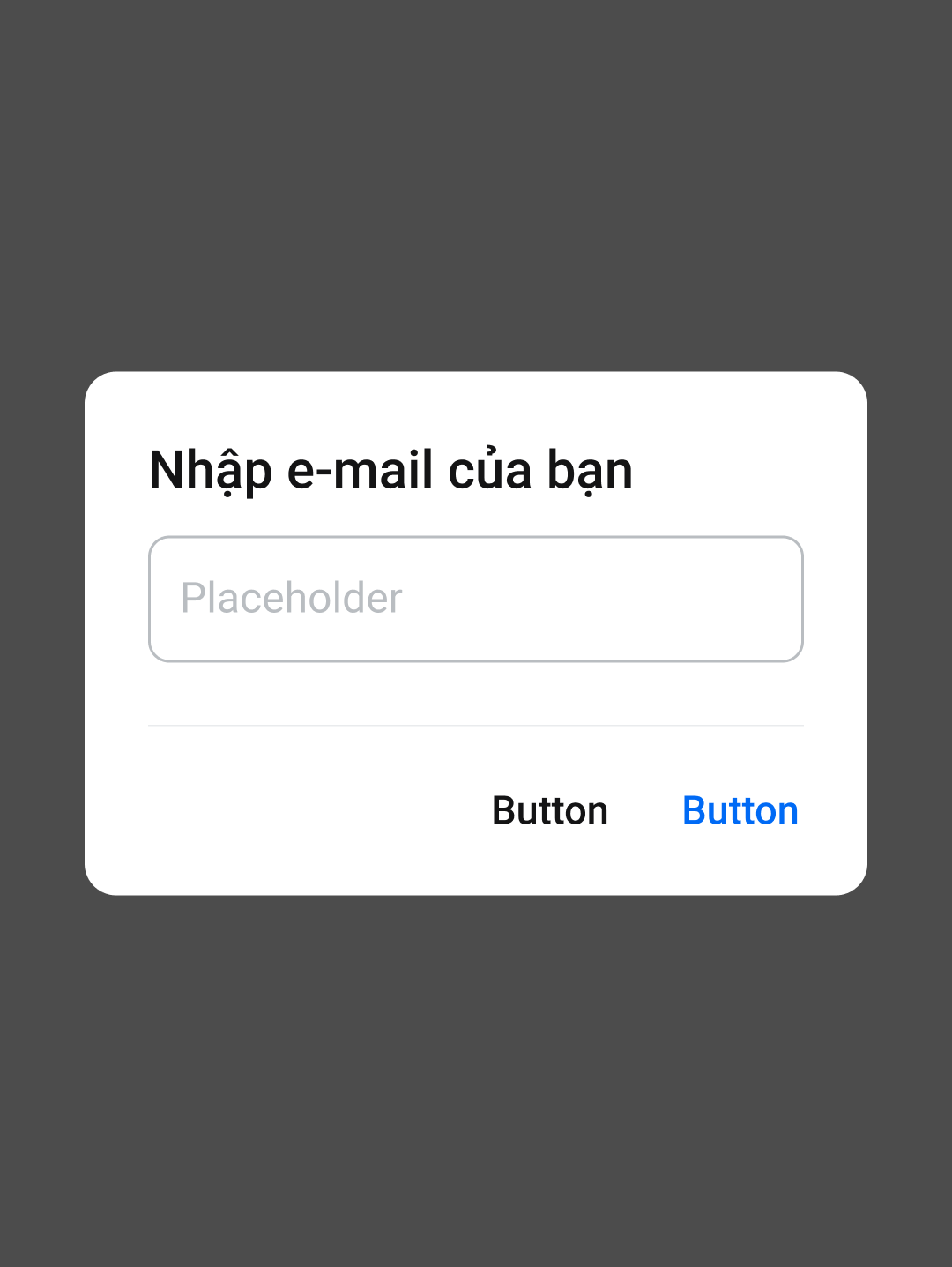
Text Input
Dialog xuất hiện sau khi user chọn hành động mà sau đó cần nhập thông tin để tiếp tục quá trình thực hiện hành động
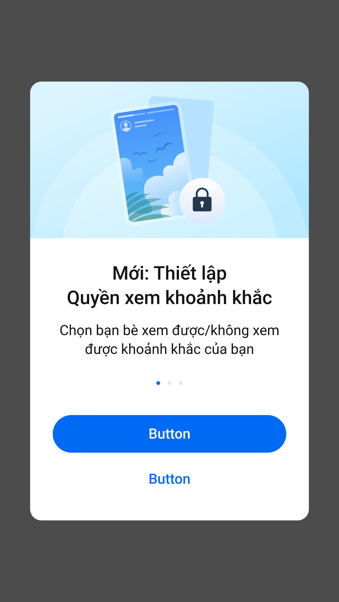
2. Promotion Popup
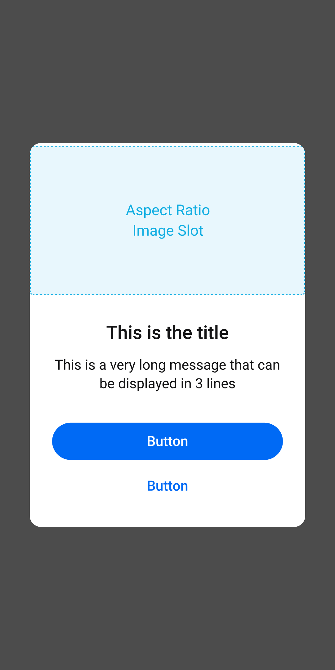
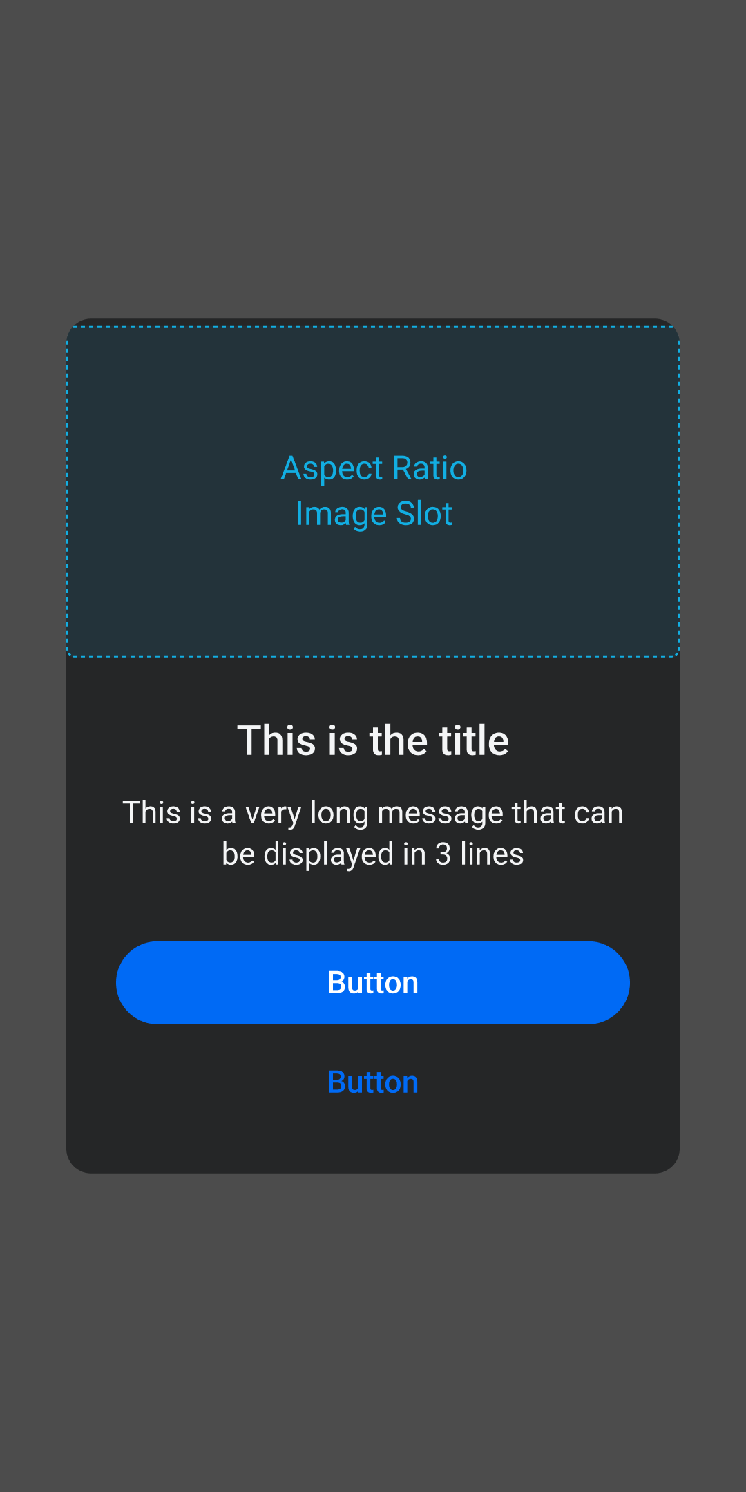
- Hộp thoại được sử dụng cho mục đích promote, introduce, onboarding cho tính năng mới
- Nên được sử dụng đúng context vì mức độ interruption rất lớn
Components
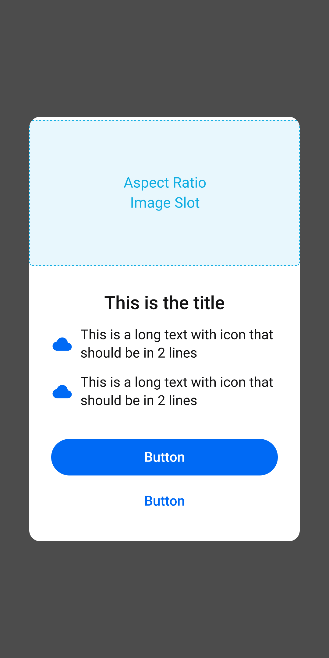
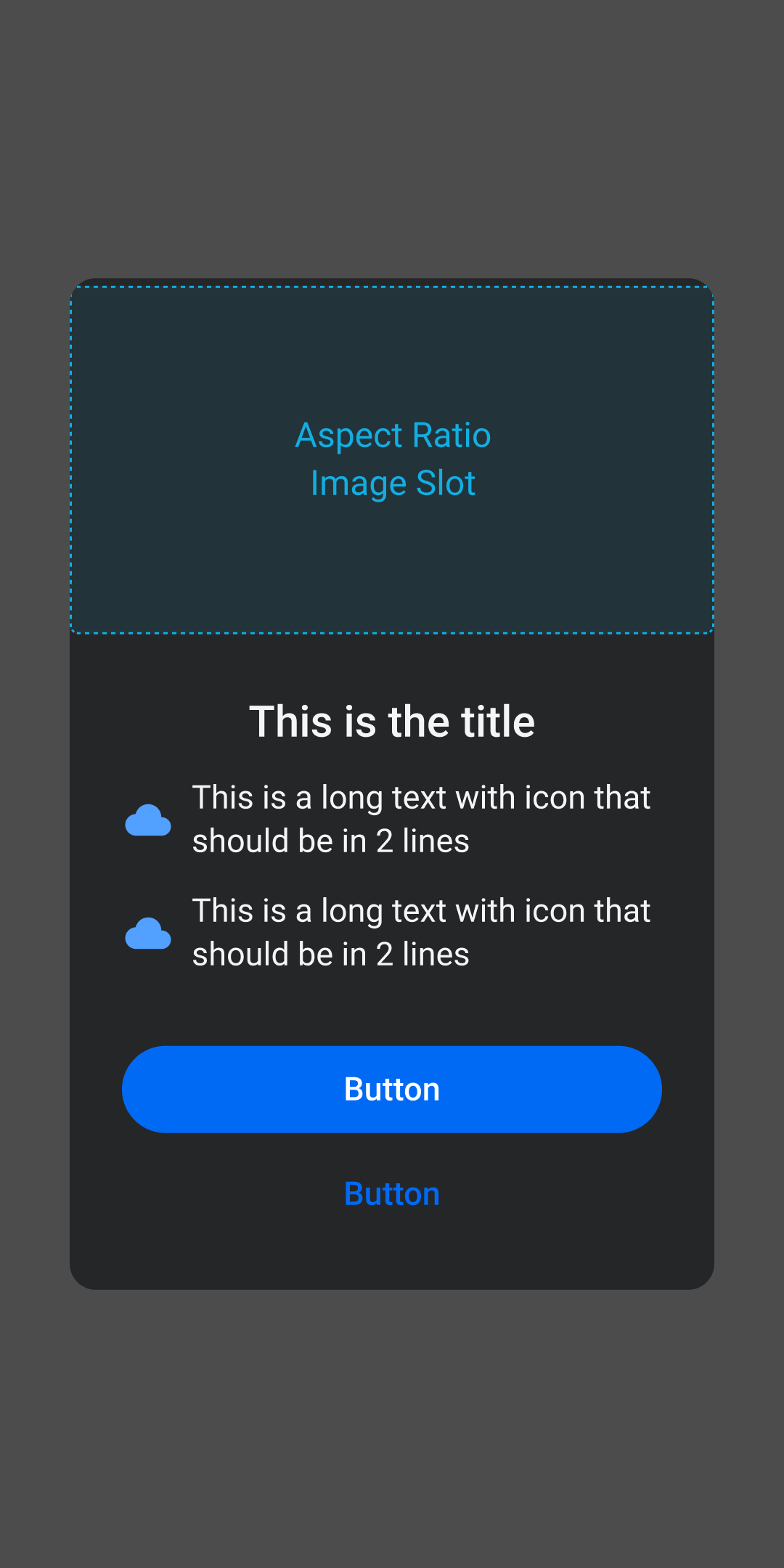
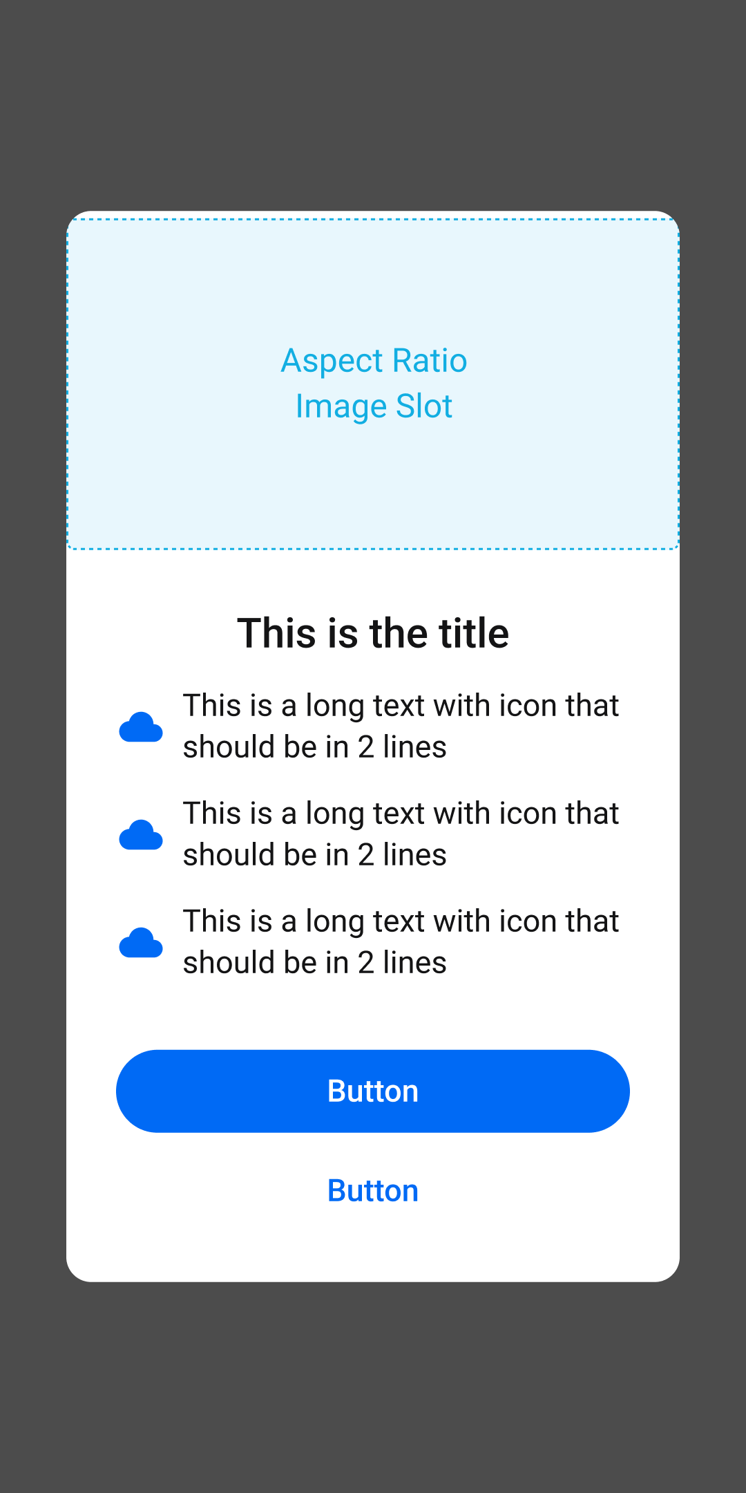
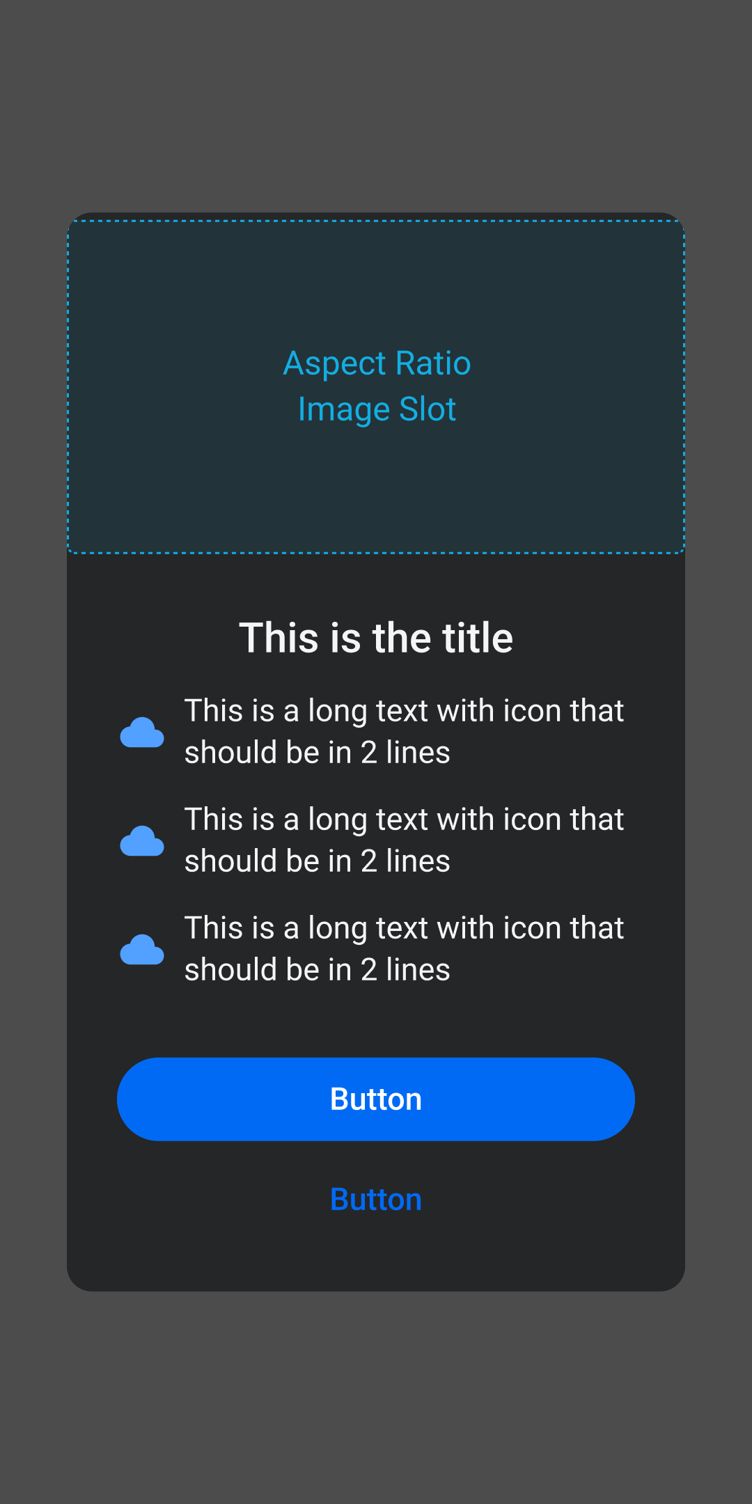
Anatomy
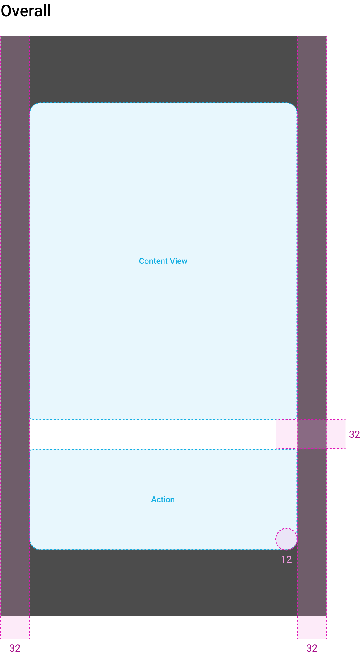
- 5Container
- Required
- 6Content View
- Required
- 7Action
- Required
- Hiển thị
- Default: 1 primary button (blue)
- Optional: thêm tối đa 1 secondary button
- 8Dim Background
- Required
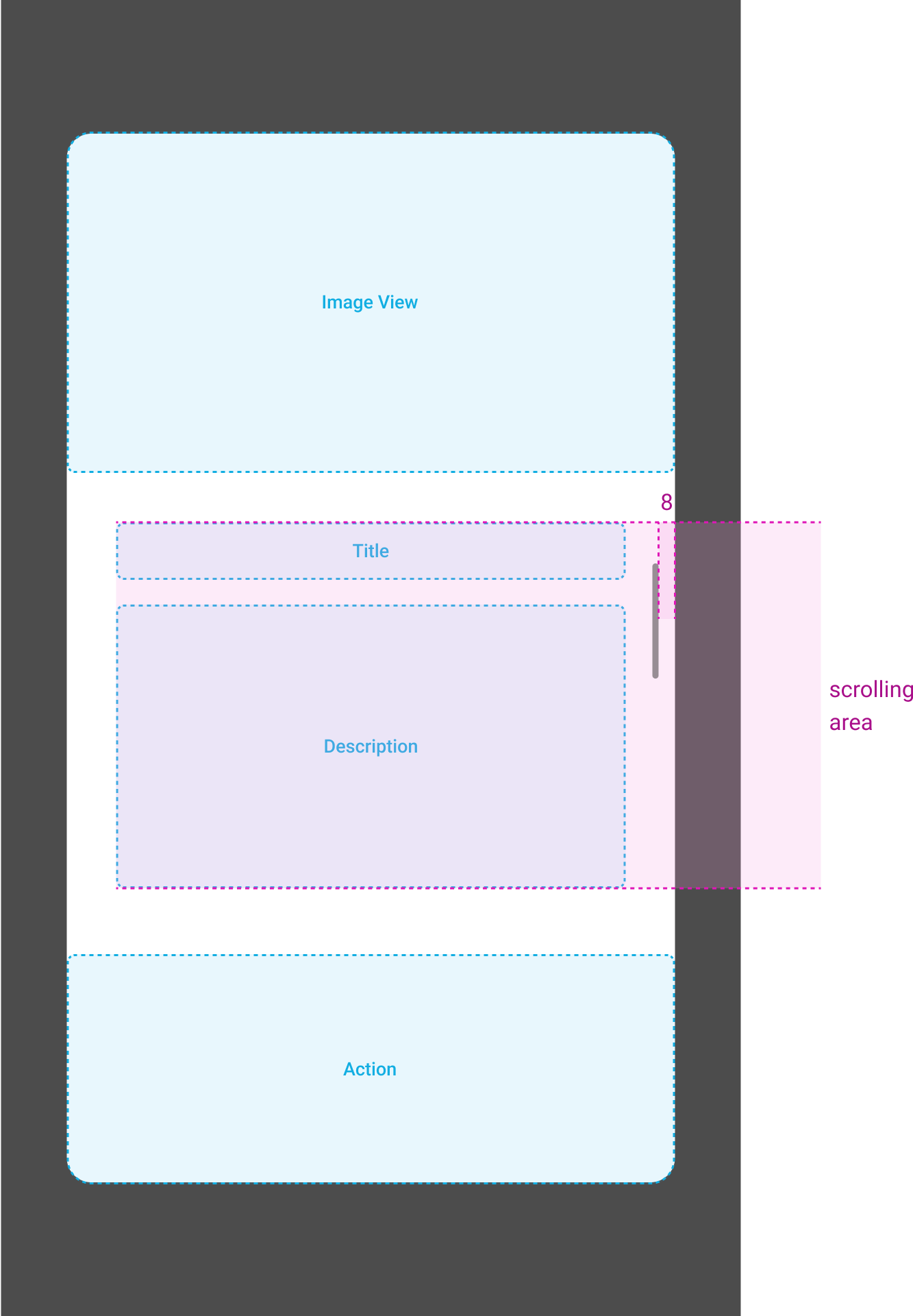
Content View
Gồm 2 phần:
- Content Page
- Page Indicator
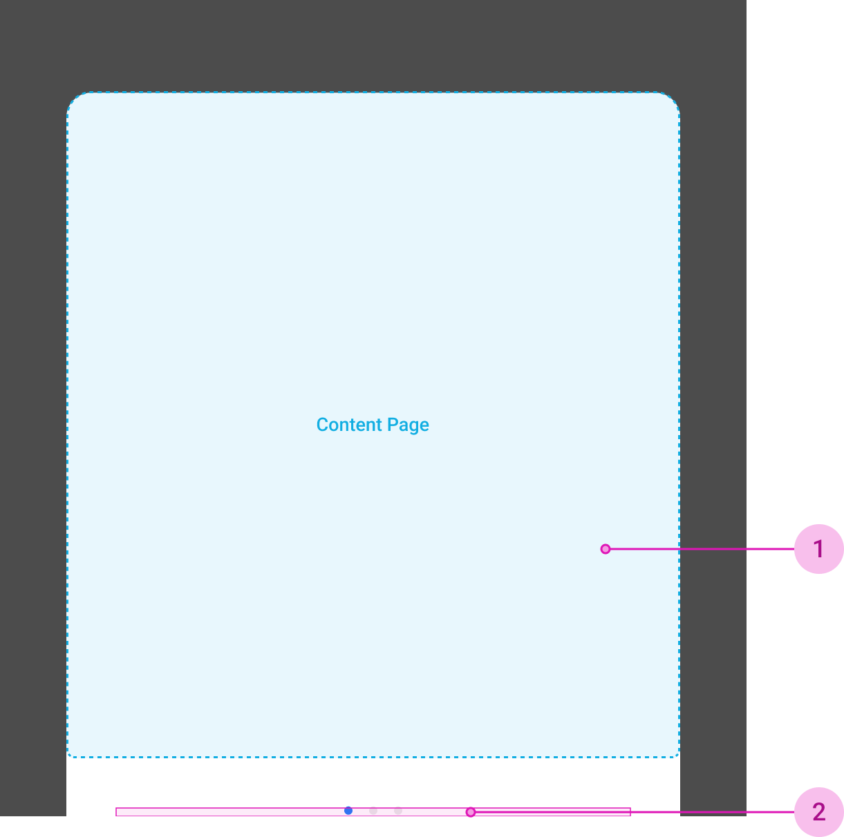
- 1Content Page
- Required
- Gồm 2 loại:
- 1. Custom (vertical tự custom content)
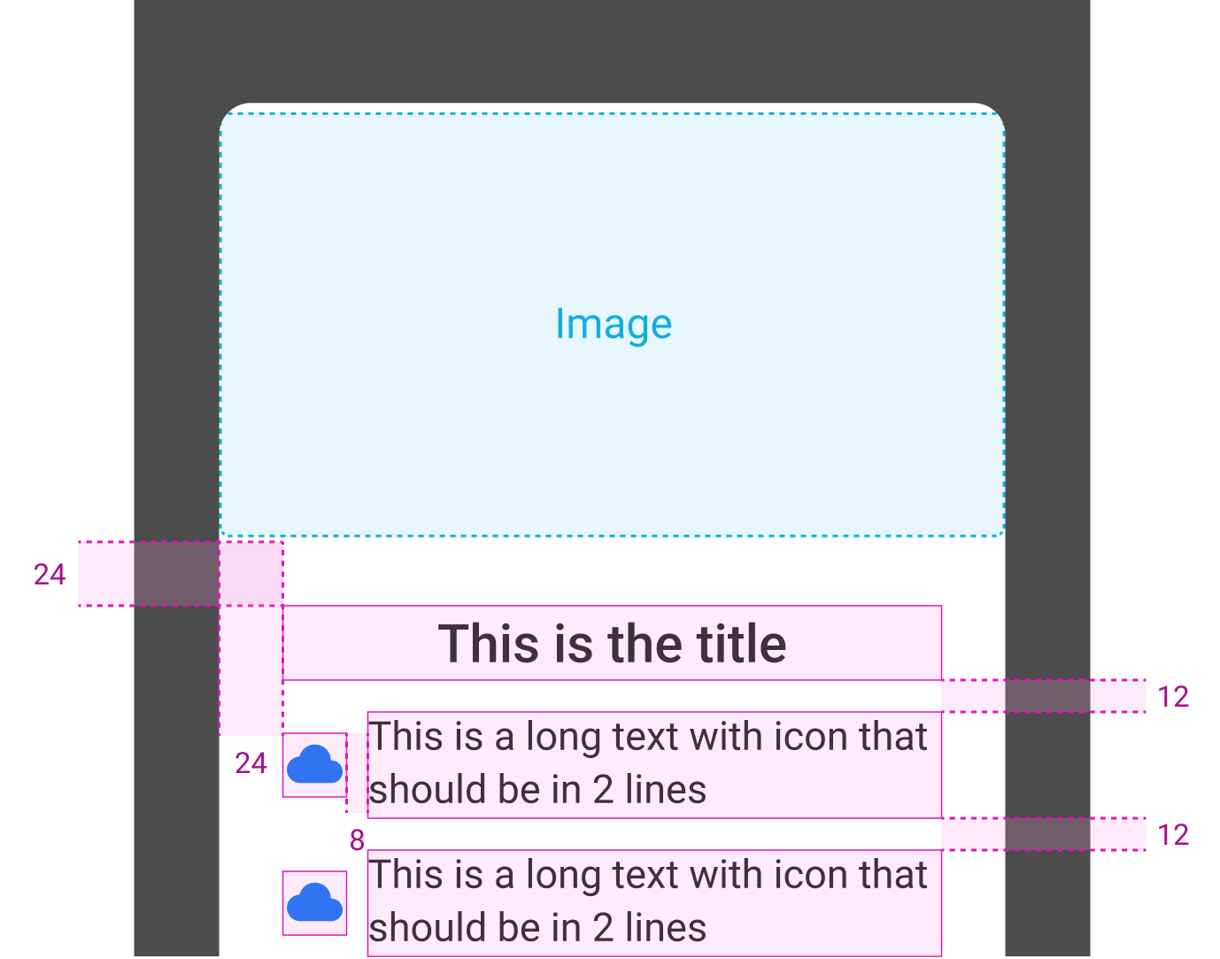
- 2. Default
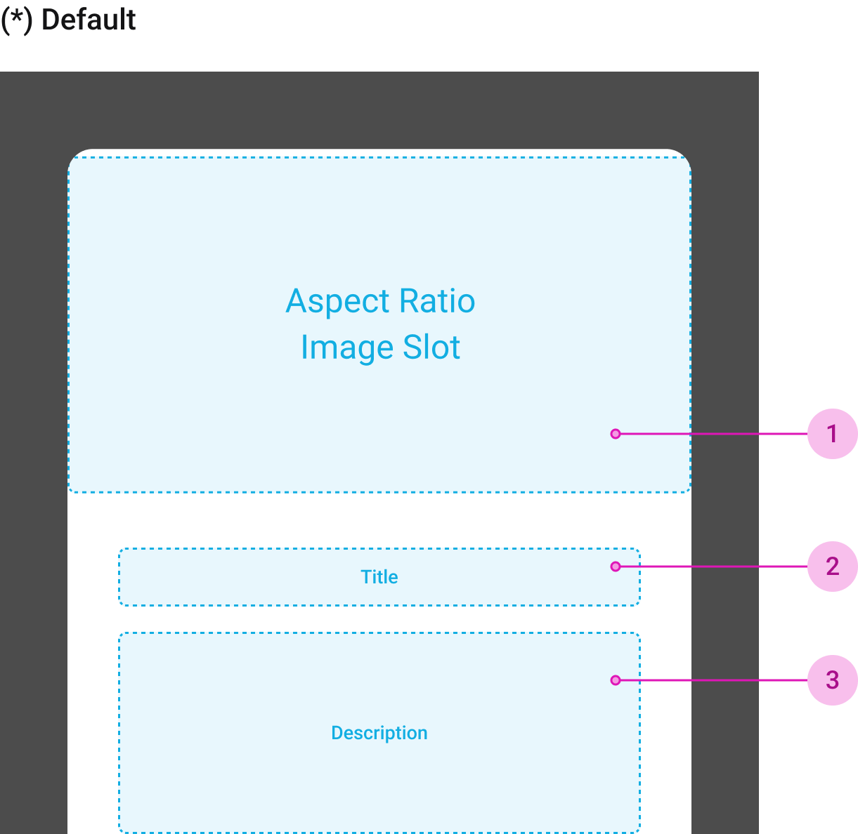
- 1Image View
- Required
- 2Title
- Required
- Không limit số dòng
- Font-size: h-normal
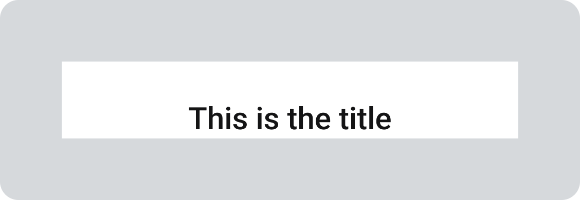
- 3Description
- Required
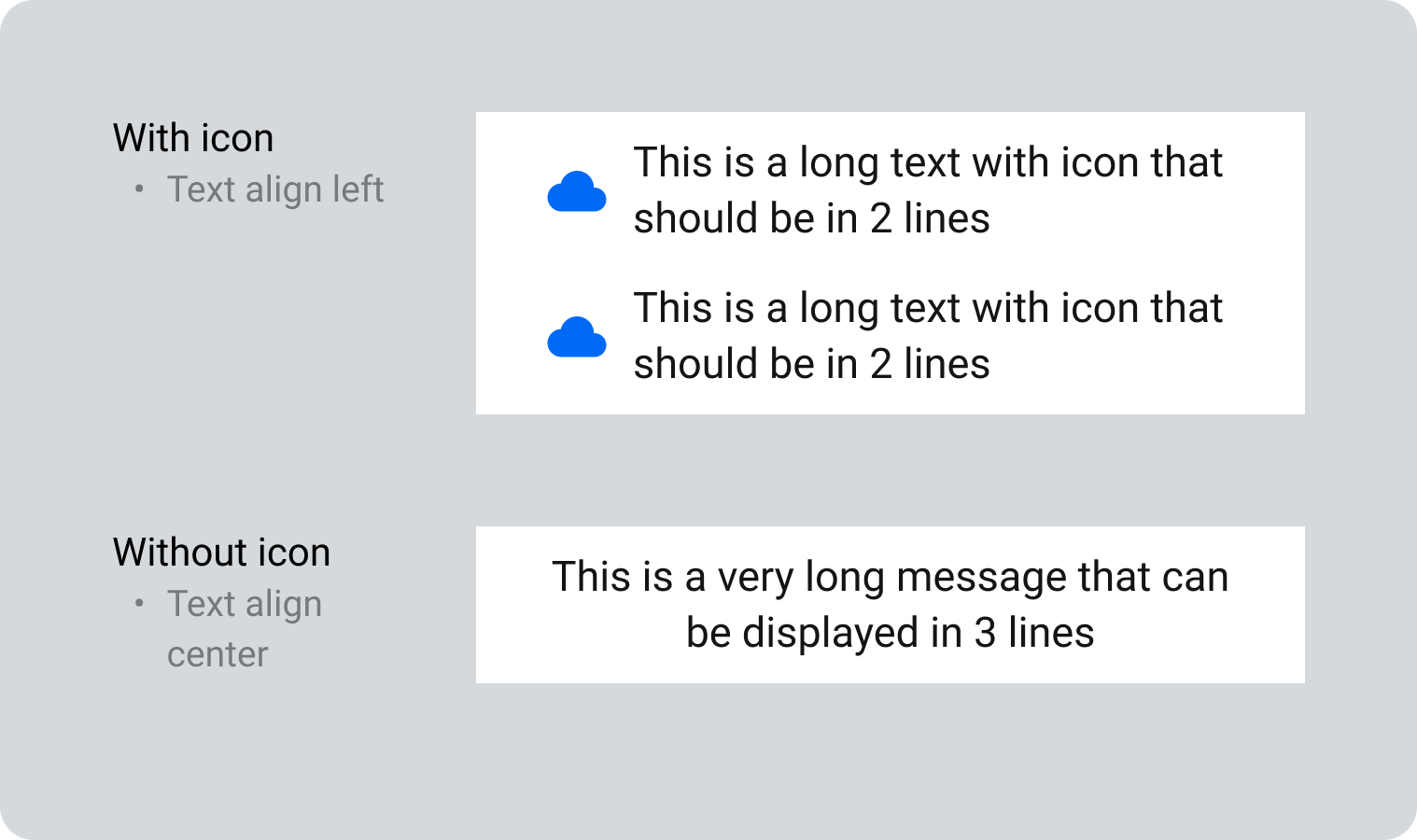
- Number of text rows
- Design: maximum 3 rows
- 1 text row: do not use icon
- 2 - 3 text rows: use icon as bullet point
- Dev: can add multiple
- Font-size: t-normal
- 2Page Indicator
- Sử dụng khi có từ 2 content page trở lên được truyền vào
Specs
Max height of dialog = 80% screen height
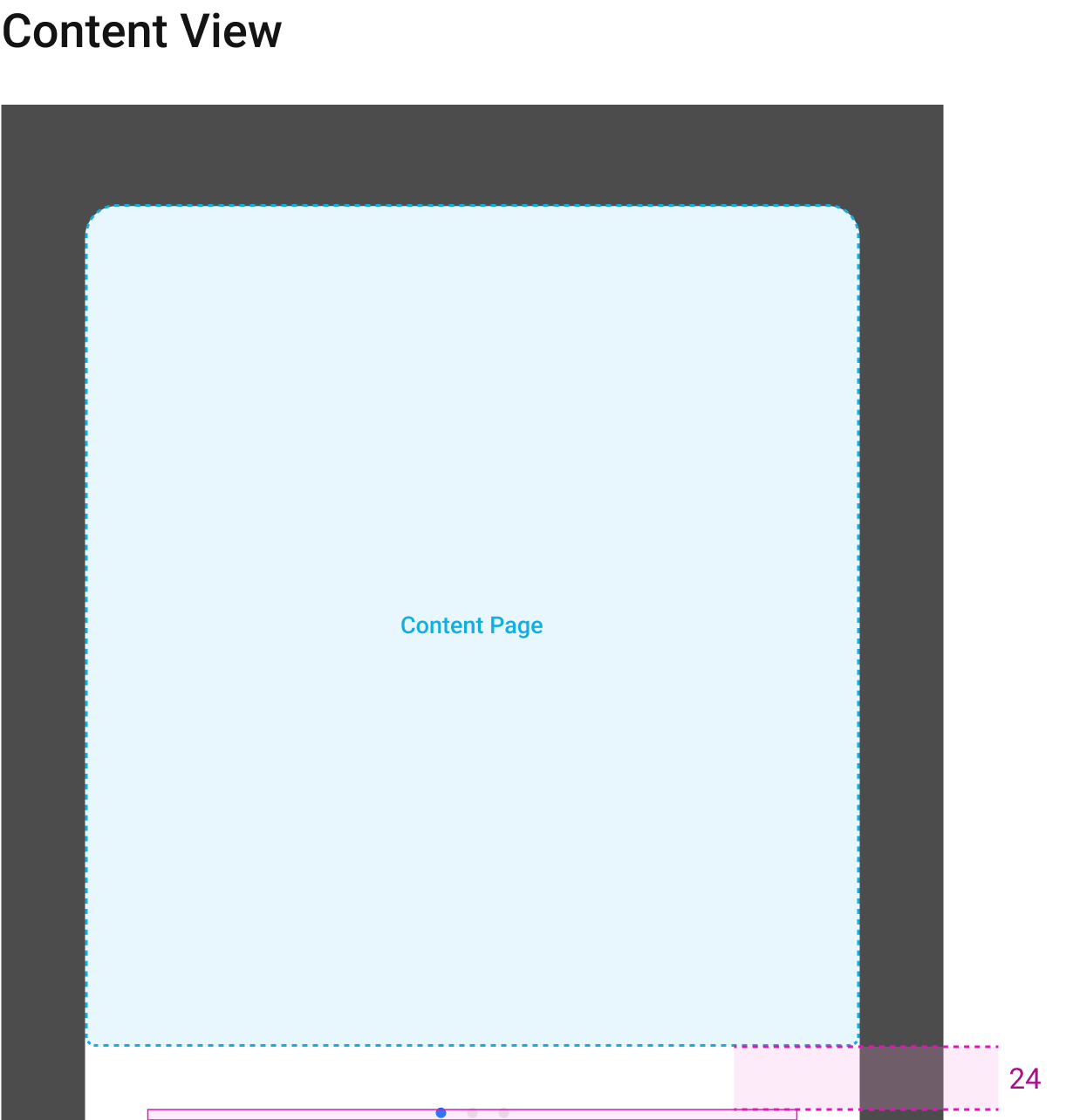
Content Page
1. Custom (Vertical tự custom)
Recommended spacing specs
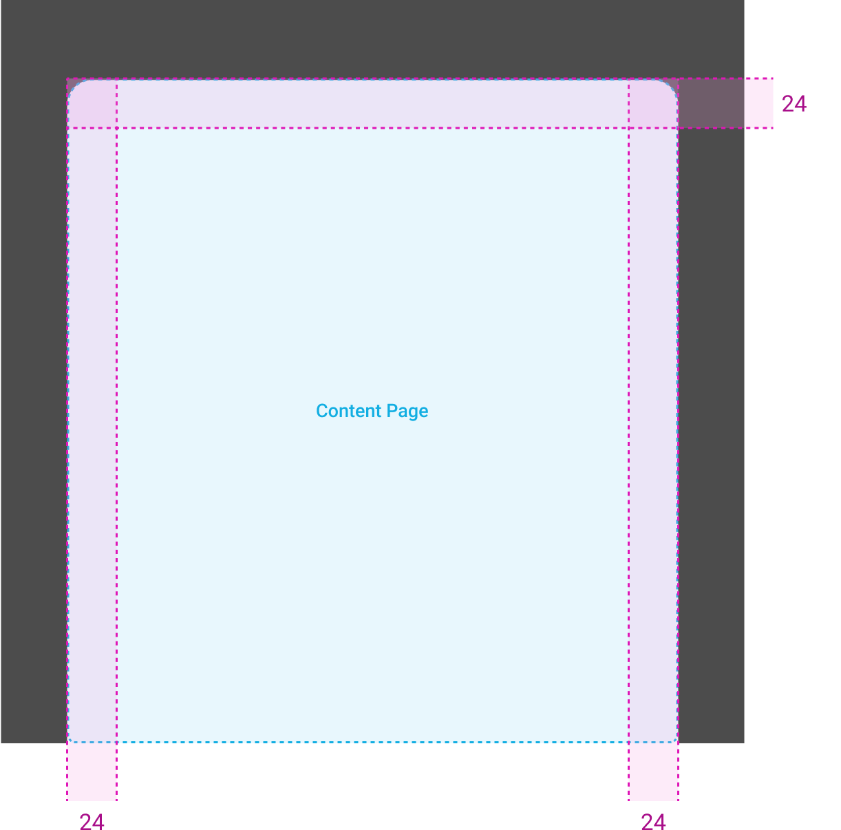
2. Default
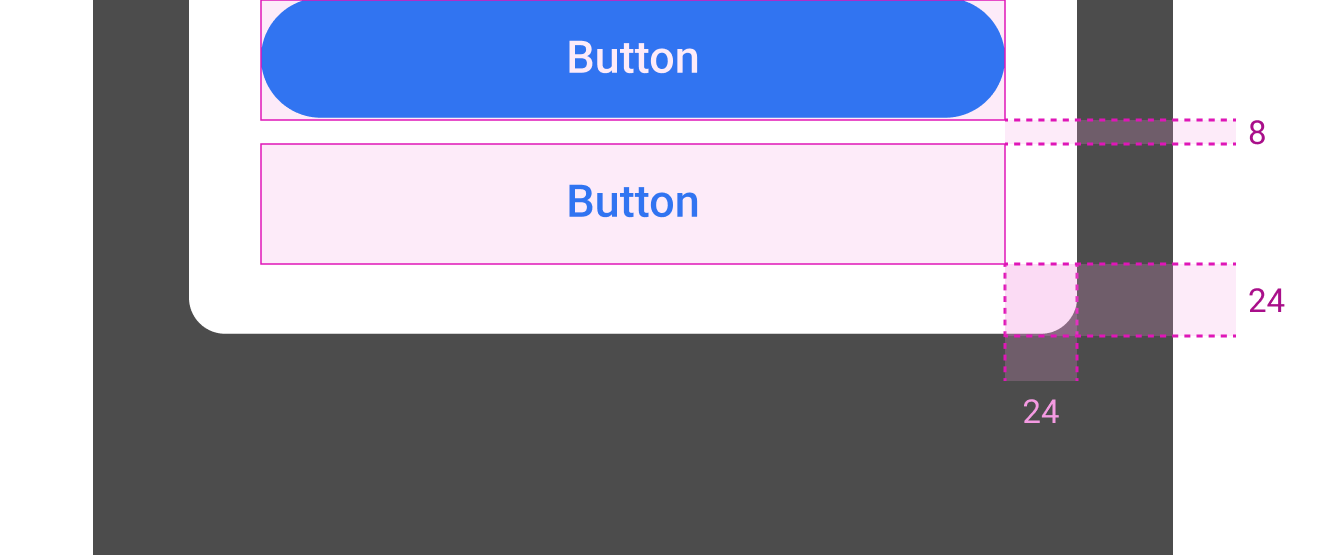
Actions
Behavior
Behavior
User có thể tắt Modal bằng cách
- Tap out to dismiss (maskClosable)
- Có thể ON/OFF
- Default = OFF
- Bấm dismissive button (bên ngoài truyền vào)
Scroll
Khi Modal chứa content vượt quá max height, cần hiển thị scrollbar. Animation: dùng ScrollView của native
Scrollbar Specs
Usage
Transparent background
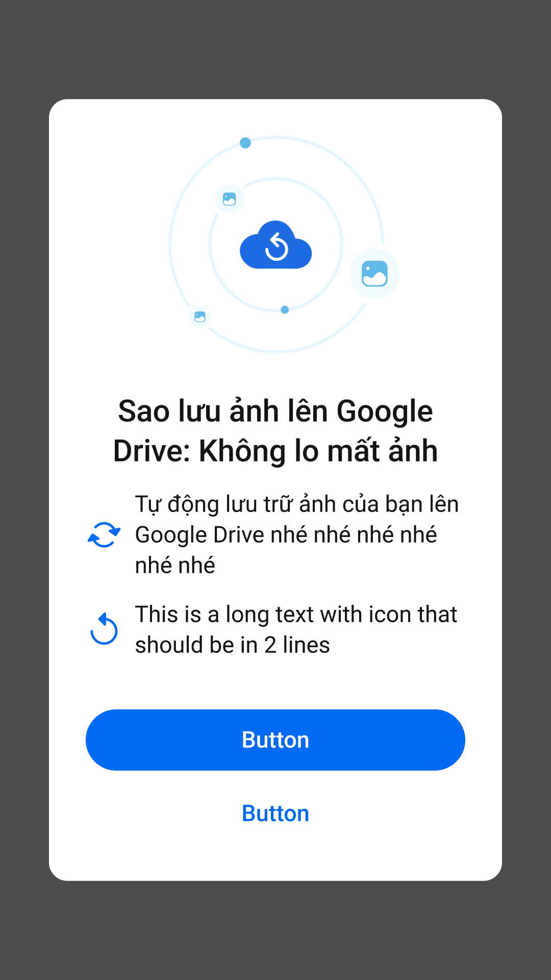
Filled background